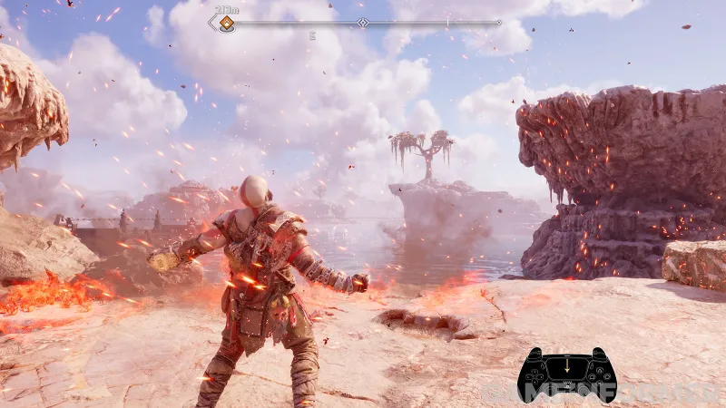
God of War Ragnarök comes with a whopping 60-plus accessibility options, from auto-sprinting down muddy roads to noticeable direction indicators for combat sequences. Above all, a deeper level of customization lets players fine-tune their own wintry apocalypse. PlayStation enthusiasts might recognize the phrase “Play has no limits” from a string of ads. Ragnarök’s lead UX designer, Mila Pavlin, echoed the same sentiments and voiced her dedication to centering players of all walks of life. “This is a fantasy epic,” Pavlin says. “This is about a father and son. This is about fate and the Nine Realms. And the ability to go into that, regardless of your background, and be able to experience all this rich detail and history and story? That drives me every day.”
A wide spectrum of consultants and testers, including veterans and blind players, helped Pavlin’ team concentrate on four key fields: Vision, hearing, motor skills, and cognitive understanding. And several impressive, new features currently cover those design goals. A high contrast mode allows players to apply specific colors to item types, character types, backdrops, and more to increase general visibility and lessen visual clutter. Audio cues coupled with captions indicate button prompts in the general area and hint toward puzzle-timing modifications. For example, skill shots – hitting objects mid-fall or swinging on an arc – are easily executed by accessing game settings and slowing down environmental targets. Without these handy adjustments, Ragnarök is prone to “blockers” or difficult interactive moments that can potentially inhibit progression and alienate players. Pavlin says the most significant task was finding a healthy balance between God of War’s intensity and enabling players to overcome challenges in meaningful ways.

A methodology called “dual channel” is pivotal to addressing this balance. The UX team’s efforts ensure players receive sensory information in multiple forms – sonically, visually, and haptically. Furthermore, options from the 2018 game, mainly text and icon size customization, are back and more elaborate than before so that all the in-game writing is legible. Abilities like Spartan Rage, quick-turns, shield strikes, and even high-contrast palettes are triggerable with swipes on the DualSense controller’s touchpad. And auto pickup makes heady battles more manageable, so replenishing health or rage meters with the respective stones in a given area won’t require much thought. “Accessibility features are not just accessibility features,” Pavlin tells me. “They also help to improve the experience for everyone. Ragnarök is about moving into the next phase. For us, that meant including more people, making sure that people can customize more, and making sure that it’s a comfortable play experience for everybody.”
Camera navigation assistance orients the view towards current objectives, platforming can be automated, and controller visualization lets streamers share moment-to-moment button inputs with wider audiences. These are just a few of the options players can tweak. But Pavlin still yearns to expand Ragnarök’s overall accessibility. “60-plus features is tremendous to get to,” she says. “I still think we can do better. I think we can push it further. But honestly, I feel like people will be excited to see just how many more players can play. And if I can push a feature to the point where one more player – just one more player – could play, then that would be the greatest thing in the world; to be able to see that one player and understand how that lets them connect with the community and connect with everyone.”
This article originally appeared in Issue 349 of Game Informer.
